Friday, April 7, 2017

Putting it together

"Bit by bit, putting it together. Piece by piece, only way to make a work of art." ~Barbara Streisand

While Barbara Streisand was referring to the art of the liberal arts, this saying applies to Relatable; throughout the entirety of this journey for my foundation portfolio, I have been building up my magazine piece by piece.

So, while my issue is not complete, I have all the missing pieces and Relatable is nearly finished. Again, as a thank you, here is a few pictures of June Relatable


Putting all of this together makes me feel a sense of accomplishment, looking at how far I've come!

Thursday, April 6, 2017

Tell me a Story

"After nourishment, shelter, and companionship, stories are what we need most in the world." 
             ~Philip Pullman 


Hey bloggers, me again with another update.

Aside from the beautiful images that successful magazines' contain inside of them (because honestly, I choose a magazine for its photo content first) they are also filled with interesting and intoxicating articles that viewers hook onto from word one. This plays a role in the article I plan to write for my double page spread of Relatable... except it won't be an entire article.

Not all stories are set in a standard paragraph by paragraph stature, flowing from one point to the next. What I plan to do will give Relatable style and character, making it differentiate and stand out against competition. As I said above, pictures are important, so I thought, hey, why don't I focus on that and write excerpts for each article of clothing and/or accessory featured? It was a good idea... it still is  a good idea... so I'm going to use it. 

When I was away on my trip north earlier this month, I traveled 'far and wide' to many different stores. While still cold in the snowy northeastern region of the country, their upcoming styles are not: several sun hats, rompers, dresses, and, of course, Swell bottles could be seen left and right. So, being the great photographer that I am, I just had  to take pictures of these garments/accessories and use them for my magazine! 

So, as a gift to all of you for being so supportive throughout my journey, here's a sneak peak of some of the photos I plan to use for my double page spread! Hope you enjoy.


Tuesday, April 4, 2017

Say Cheese

"Cheese tastes good." ~me

While I very much enjoy a wide assortment of cheeses, this post is unfortunately not about literal cheese. Instead, I will be talking about my photos of my model Sanjana.

It was a Sunday, 12:00 noon on the dot when the doorbell rang. Santana was at my doorstep, ready to shoot some photos.

The first picture I shot was for my cover. On my cover, I had envisioned a bathing suit shot, tying in with the summer theme. I had Sanjana try on a few bathing suit tops, option for her to wear jean shorts on the bottom to prevent accidental inappropriate content (because we don't want that). In the end, the picture came out just the way I wanted: after playing around with lighting, I got the image of Sanjana outside lying on a beach towel.

The second picture I shot was for an adjacent page to the table of contents. For this, I planned to have a more formal look with a cute romper. I took several shots of Sanjana at different angles, some in standing poses and others lounging on a picturesque lounge-couch. I still haven't decided which shot to use for my magazine, so I will be playing around with a few of them and choose whichever looks the best on the page (I have a feeling it will be a longer, vertical shot though).

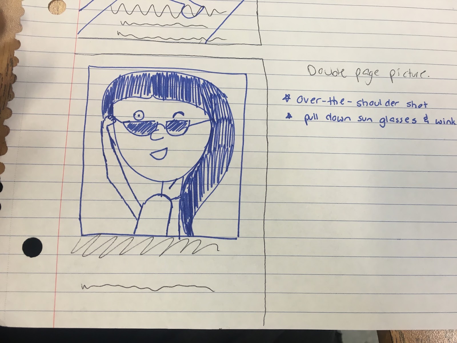
The final picture I shot was for my double page spread. For this, I not only wanted the camera to be closer to my model and capture an over the shoulder shot, but I wanted her to be dressed in a sporty attire. Summer is not just about going to the beach or going out for a nice dinner at the beach; the beach does not make summer! There are so many other aspects of June that people forget compared to the beach in the hot summer sun, such as a workout lifestyle. I wanted to focus a little on this concept with Sanjana's attire in this third picture.

So, now that I've explained it all, I's going to get dow to business, finish this project, and look summer ready while doing it!

Sunday, April 2, 2017

Uptown FONT it up

The title is cheesy, I know, but at least you all know what my topic will be for today... FONTS!!!!

While I had already created some of my pages for my issue of relatable, my group had not. They also informed me that they wished to utilize a font entirely separate from Joomag. In case any of you have forgotten what Joomag is, Joomag is a website that allows users to create and edit their own magazines to the way they see best fit. So, because of this, a font change was in order.

At first, I had no idea where they were going with their fonts, I thought what I had was fine. But then they reminded me that the 'RELATABLE' title must be uniform; I thought they could have just chosen the same one that I had, but that wasn't the case. Thus, one morning in class, my group members and I sat together and scrolled through fonts on a website called Dafont (the link will be at the bottom of the page). It featured several cool and unique fonts that I had never seen before in my life! Together, the three of us choose a font unanimously and went to work on our separate issues.

Downloading the fonts was a little more complicated than I would have liked, but I eventually figured out what to do. The first step was downloading the font. It would then pop up on your screen and say it was downloaded. I know, you're probably all laughing at my "stupidity", but trust me when I say it was more complicated than this. Once it downloaded, for some reason, my laptop forced me to download it twice (I downloaded another font to make sure I was doing it correctly and I had to go through the same double process). Then, and only then, would it pop up as a useable font on my laptop.

Following that step, I had to add the font to my Joomag fonts. This step was relatively easy compared to the first step. All I had to do was click on the font button on Joomag, press the plus sign-- indicating that I wanted to add a font-- and searched for the font in my database. Once finding it, I double clicked it and BAM, it was added to my Joomag fonts.

I would love to stay and chat some more, but I'm off to go photograph my magazine model! Don't miss me too much though, I'll write soon <3

http://www.dafont.com/new.php

Saturday, April 1, 2017

Photoshop is a Blessing

I have a ground-breaking update: photoshop is useful!

When beginning to get pictures for my newspaper, I did not have the intention of utilizing photoshop for my images. At the time, I did not have photoshop on my computer nor was I patient enough to wait to get it/pay for it if need be. Boy was I being foolish.

So, as a result, my dad, Joey, who is a mastermind when it comes to anything computer or technology related, decided to sit down and help me find an alternative source to photoshop. Together as father and daughter we scoured the internet, looking for something that made cutting and cropping a photo appear an easy feat to accomplish. After about 10 minutes or so, we came across an app called GIMP. Essentially, GIMP is exactly like photoshop, but it didn't work out that way for me unfortunately.

The first challenge was downloading GIMP onto my computer. Since GIMP isn't an app from the Apple store, my computer, a macbook, was being stubborn and wouldn't let me download it for 10 minutes. Finally, fed up, I went to my Finder tab and found another secretive way to unlock my computer for a moment, download Gimp, and then lock it again.

So, once this problem was out of the way, I was thinking 'this will go great; smooth sailing from here.' Ehh... wrong.

GIMP was giving me major problems. It was not user friendly, which was an aspect I was in dire need of. The cutting tool, which allows you to trace out the shape of an object in a crop so there is no visible background, was not doing so much cutting as it was making dotted lines all over my page. GIMP opened up new tabs, didn't trace my shapes correctly, and took me steps backward when cropping; not fun on my end.

So, surrendering my pride, I ceded to photoshop. Though I was very against it in the beginning, as long as t creates my images the way I pictured them in my head, it will have to do.

Friday, March 31, 2017

Sketch it

"A picture can say a thousand words."

One of the most important aspects of a magazine is the pictures contained in it. As a child, I know I didn't read books for the words, I looked at them to see the beautiful pictures or illustrations contained inside of the. The same goes for a magazine. A good picture could be the difference between a person picking up Relatable and taking it home for a good read or the magazine being left for the dumps.

Since I am going with summer trends (this includes fashion and accessories) as my story for the double page spread, I have already captured photos of cute new, unique clothing and accessories, some of which I had never seen before I took pictures of them and were really cool. However, I must include other pictures in order to harbor as little 'white space' as possible. White space is the blank or empty content on a page. I'm not saying more image content is better, because it is not in all cases, but when it comes to laying out a page, there should not be any empty space because it will appear awkward to the eye. I had to learn this the hard way after laying out many pages for my school's newspaper.

So, what pictures do I still have to take in order to put the whole enchilada together? For one, I need a cover image. I also want to include a model-esque image on the page adjacent to the table of contents as well as on the first page of my double page spread. Thankfully, one of my good friends, Sanjana Pai, agreed to help me out. She, like me, is a Media Studies student and has to create a Foundation Portfolio as well.

Sanjana will be modeling a few trendy summer styles for me; the question now is how do I capture my image with the click of a camera? This I have the answer to as well: it is called planning. I have sketched out three separate images that I wish to include in Relatable's June issue. Now, I'm not the greatest artist and these were relatively quick sketches because I wanted to get my ideas down onto paper; please, no hardcore judging!


Sunday, March 26, 2017

Every story needs a Table or Contents

Good morning/afternoon/evening/night (for whatever time you are reading this),
If you hadn't guessed from the title, today I will be discussing my Table of Contents.

There were some features I immediately wanted to include in the Table of Contents, one of them being my obvious color scheme. A second feature I wanted to include was to have the words 'Table of Contents' in three different fonts, colors, and located in the middle of the page. After this however, I found myself stuck.

As I've disclosed before, I am a newspaper student at my school and I have to layout pages for my newspaper; this should be no different. But it is. In newspaper, we are hand-given the stories that we will have to put on the page, told which style headline the page will need, and given the pictures directly (they need a caption depending on what they are.) For Relatable, I must create my own content; this includes stories and images. That's what makes this so complicated.

So, being stuck as I was, I ventured into the vast internet to try and find some samples that I could use for inspiration.


While I took bits and pieces from these two examples, such as the circles around numbers, I also discovered a website, design school.canva.com,  that featured many different table of contents. The link, along with the links to the pictures, will be provided at the bottom.

For now, my Table of Contents is incomplete, I have yet to take pictures for the pages. However, I have a pretty good idea of what I want now, and it does not include much change to what I am currently producing.